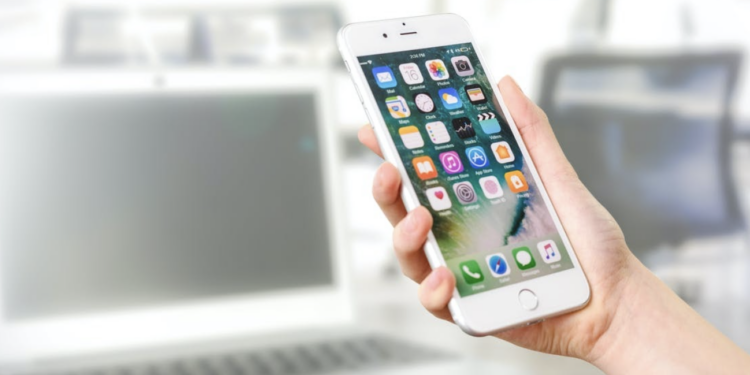
Running an application with a user-friendly interface gives a user seventy percent satisfaction when using the application. Imagine opening an application you just downloaded only to discover that you can not find your way around it; the next thing is to install the application. No matter how beautiful, creative, or beneficial an app is, a user’s interest automatically begins to decline when they find it difficult navigating their way around it.
UX design provides a modeled representation of an app with the major focus of the designer on the experience a user gets when using the app. Hence, to get an excellent app running, a UX designer must know how to create an outstanding user experience, especially in android app development.
Ux Guides For Creating Awesome Applications
Here are tips to help create an excellent UX design for applications.
-
Keep Things Direct And Simple
Users love it when they can easily locate a button or switch to a different tab without going through a long process. See to it that navigation buttons, menu bars, drop-down buttons simple to locate and less stressful to use. Users love simplicity.
-
Build Emotional Attachment With The User
When designing an app, include details that build a connection between the user and the app. The user should feel warm and comfortable when using an app. For example, when waiting for the app to process something, your wait screen shouldn’t be blank; rather, it should keep the user mentally engaged and entertained. An example of building emotional attachment is seen in the phone master app that shows a rocket flying when boosting the phone’s speed.
-
Create Entertainment
Input elements of fun and entertainment into the user’s experience. You can tell stories of how a user swiftly carried out an activity using a feature in the app. However, make sure it doesn’t pop up so often that it disturbs the user. You can add social features like links to online communities of users and social media handles.
-
Ensure Consistency In Omnichannel Experience
General navigation keys such as menu, drop-down, and settings button do not change the basic layout. Generally, people are familiar with a particular layout, such as a triangular-shaped button facing downwards to show drop-down (that’s to say there’s more option). Changing such a layout can make it difficult for the user’s to locate the button. Also, your web application layout should be the same as that on your mobile application. For example, Asana mobile app shows consistency with their website when creating tasks. Another example is Google Earth.
-
Create An Avenue For Communication
The apps should be able to seek and get confirmation from users. For example, before exiting an app, users should be asked if they want to save new changes to activities carried out on the app, if they want to exit the app, if they want to delete something, and so on. Thus giving the user a sense of control and security that common mistakes wouldn’t cost him so much loss. Also, leave an avenue for reviews.
An app does not need to complex to serve users well. Also, creativity does not have to be complex to appeal to users’ satisfaction; users enjoy simplicity more. You have just been provided with basic guidelines to help you develop brilliant user experience design for apps. Leverage this information and experience an upgrade in your skill output.
Founder & Managing Partner of Trajectory Capital and CEO Trajectory ALPHA Acquisition Corp NYSE: TCOA.
Lifetime entrepreneur, mentor, Board Member obsessed with the infinite realm of possibility in the digital transformation of the world. Founder & Board Member TruVest, MainBloq. Board Member Beasley Media (NASDAQ: BBGI) Kubient NASDAQ: KBNT, Fraud.Net, Hoo.Be, MediaJel
